Campaign manager redesign
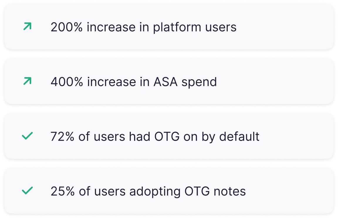
Improving the UX/UI of Luna's Campaign Manager, significantly enhancing user engagement and satisfaction, to help increase the user base by 200%.
My role
Lead product designer
Team
2 Developers, 1 Product manager, Marketing
Timeline
6 month
Background
Luna is a Marketing Intelligence platform that drives growth by providing Visibility & Control over marketing campaigns on multiple channels. The main screen for viewing, analyzing, and actions was a campaign manager table.
Luna (ex-Bidalgo) was a 10+ year old product. it was acquired by Iron Source in 2021 and merged with another team in London. The platform needed a new unified design language.
The many years brought with it performance issues and an outdated platform. Making any seemingly simple changes meant trying to untangle many years of legacy code.
This project was a 6-month long project broken up into sizable Chunks where I defined the strategy with key stakeholders and collaborated with engineering on various technical challenges.
Business need
Luna dedicated its attention this year to solidifying its position as the top revenue-generating platform for Apple Search Ads campaigns. Introducing a freemium model was a strategic move to attract new clients unfamiliar with the system. The platform faced increasing competition from newer players, prompting a necessary evolution towards a more sophisticated and high-performing software to better serve user acquisition managers.
Goal
Update the campaign manager and fix usability issues, add new capabilities to increase product-led growth. The bottom line was to have more Apple search ads clients spending money and taking action through Luna. This was tracked by monthly recurring spend.
Breaking it down
I started by watching usage videos of the platform and seeing analytics on different functions of the page, I already had a backlog of user pain points and requests over the years. I focused on creating better hierarchy between elements. We also wanted to highlight an old feature (over time graph) and give it space in the already crowded page. The page was divided into:
Filters
Table
Overtime graph
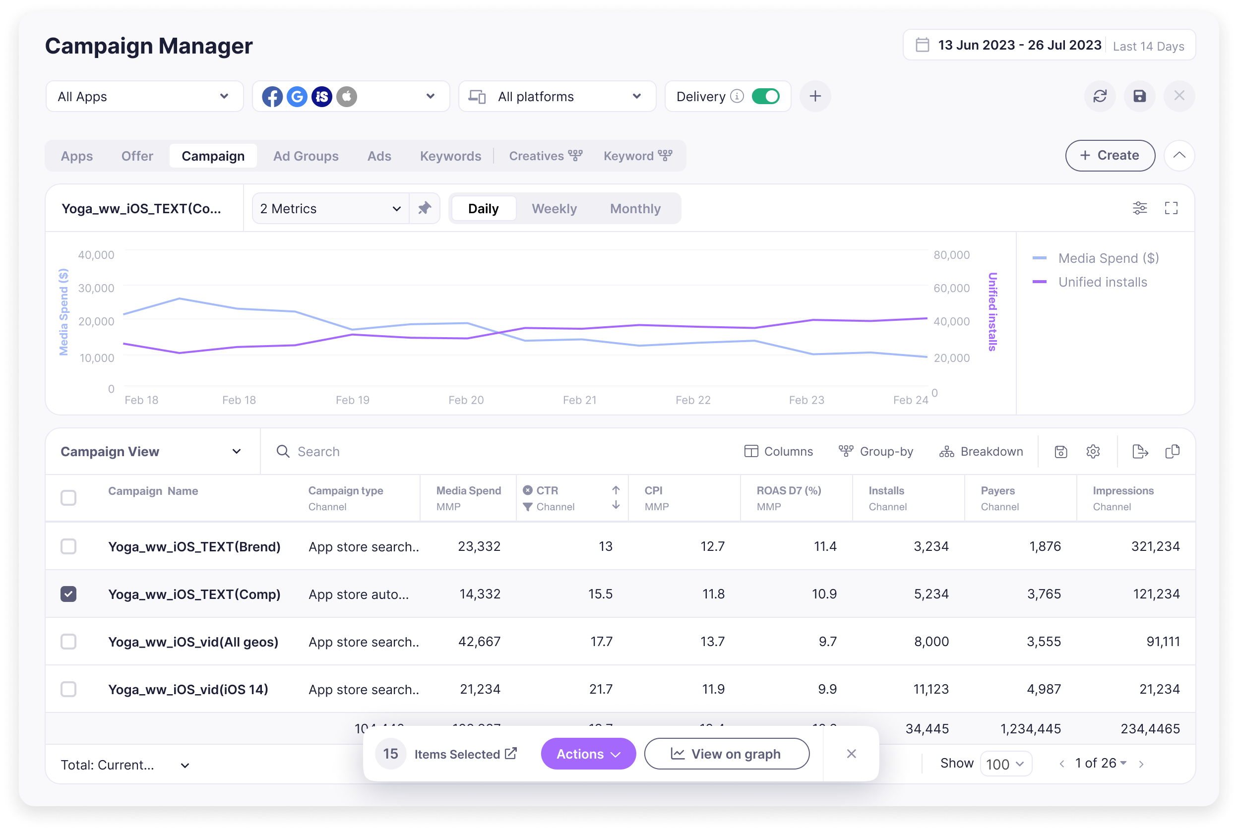
Filter bar
The old filter section was outdated and took a whole extra bar even if you only added one filter. I made the filter bar responsive so that depending on the screen resolution you could add new filters without losing vertical space.
The Update CTA was also changed so it transitions to primary color and grow’s in size when data needs to be updated.
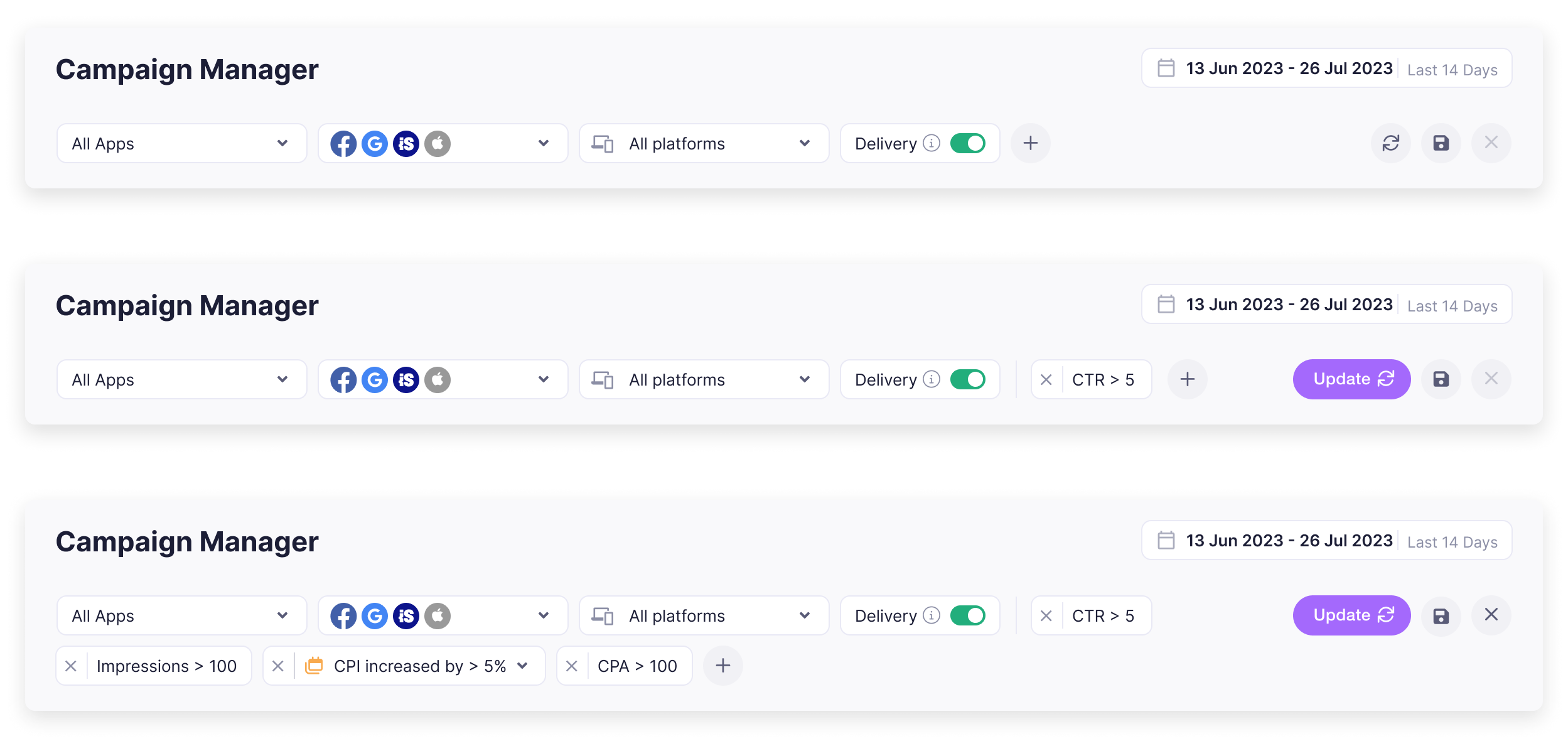
Filter component
This was a feature we added after the initial redesign. We updated the filter components design and added a new date comparison function. The added value we brought here compared to the big channels (Meta, Google), Was the ability to filter the data based on the change parameters the user wants to see. This gave great value to our clients.
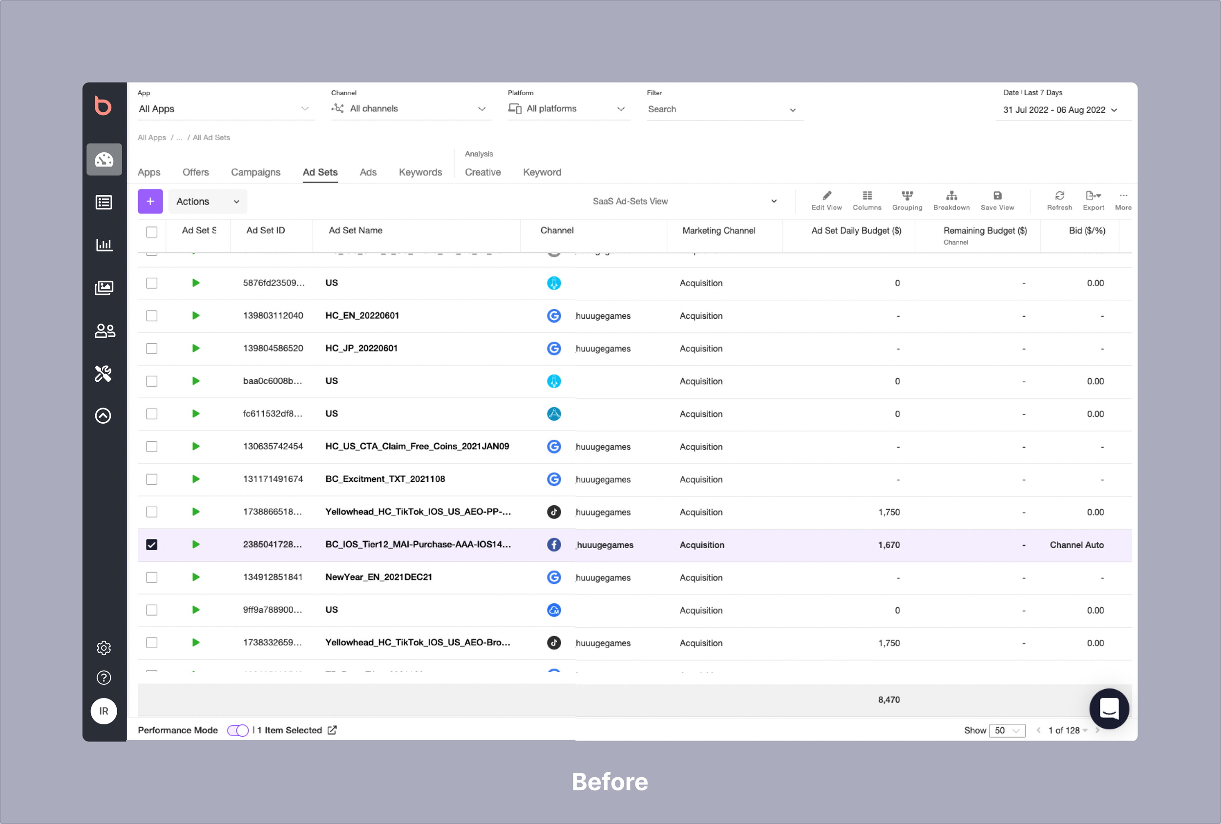
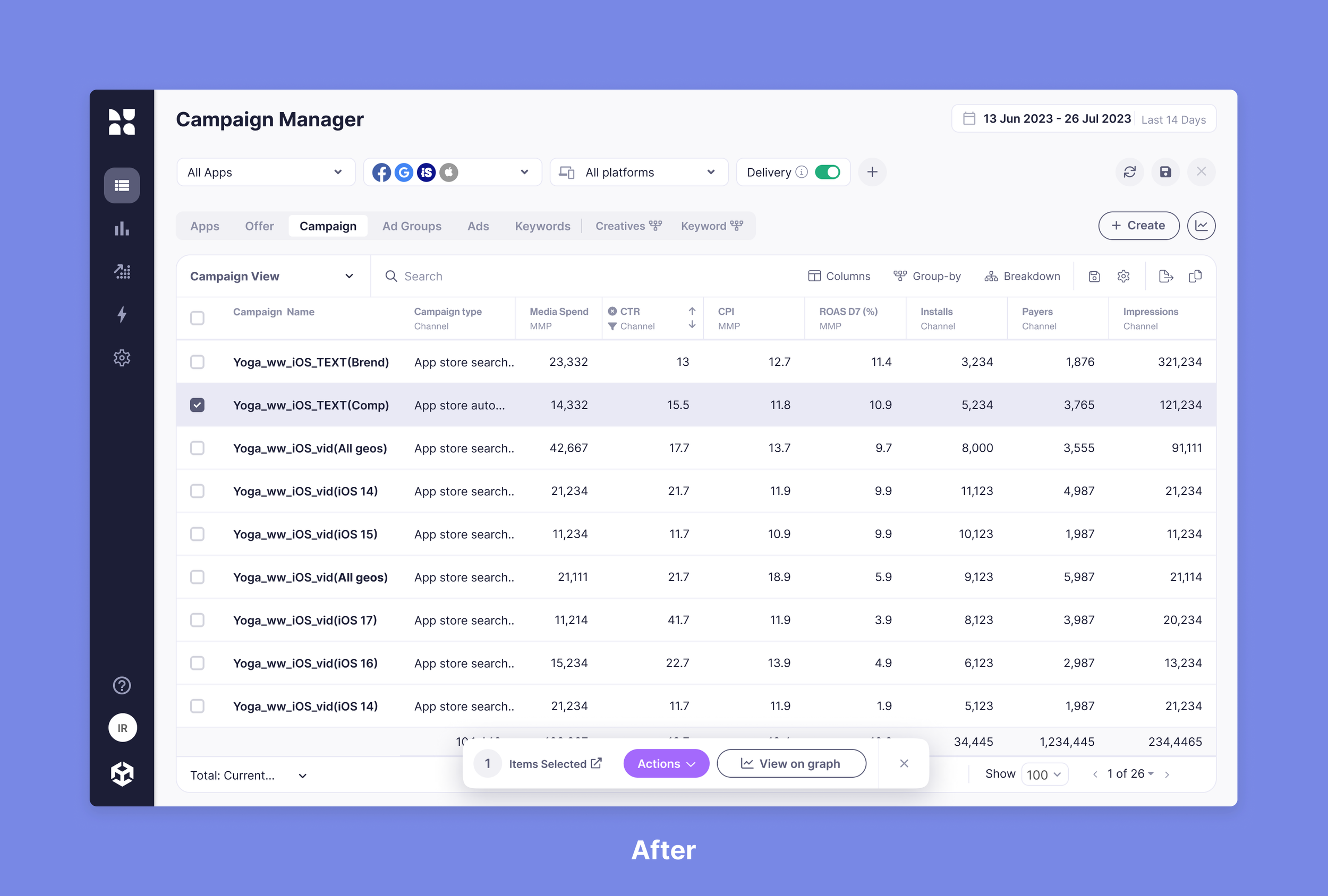
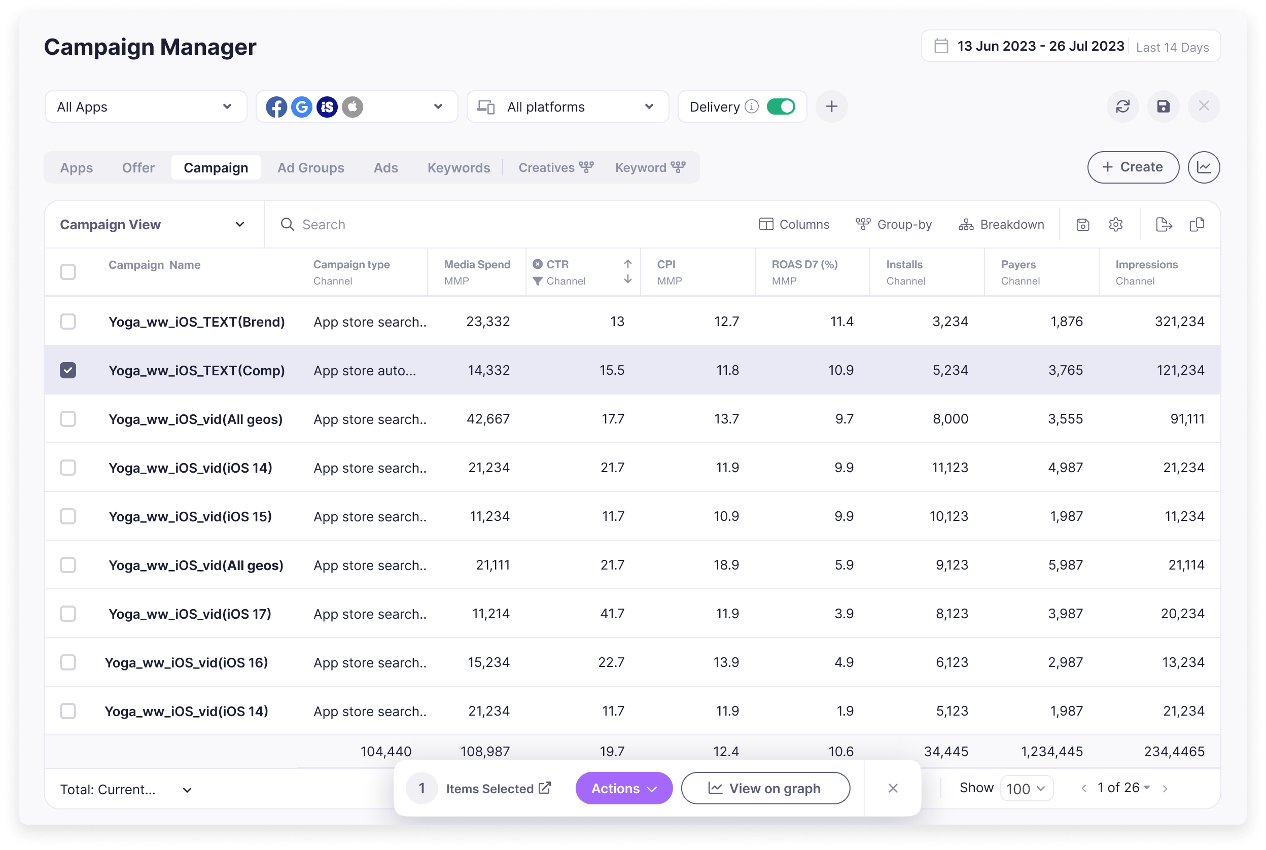
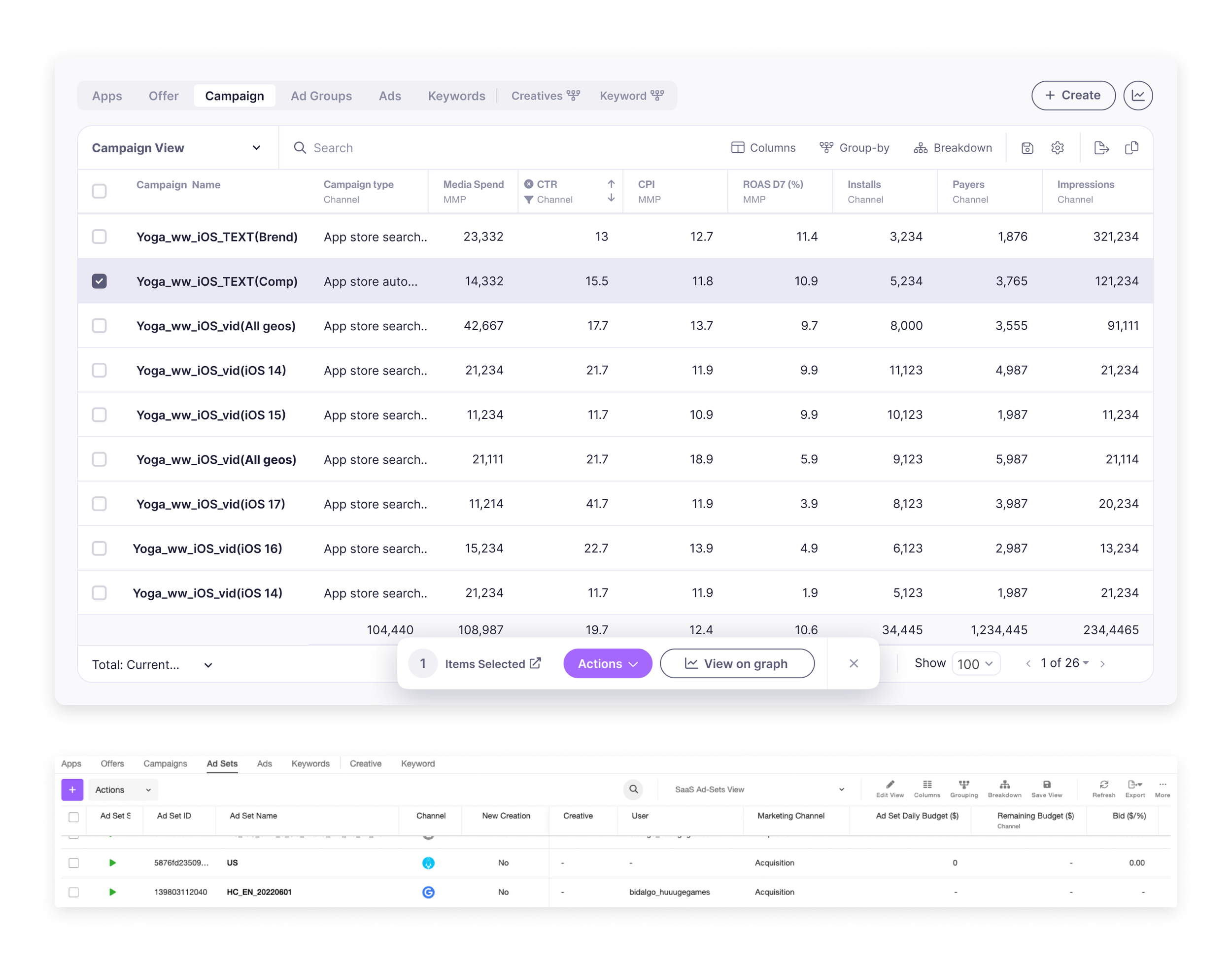
Table
I reorganized the table layout and functions to enhance clarity and efficiency, ensuring that it remains easy to navigate and is tailored to the most frequently used features.
Selecting an entity (row) now opens a new action bar that lets you select different actions and view the entity over time in a visual way
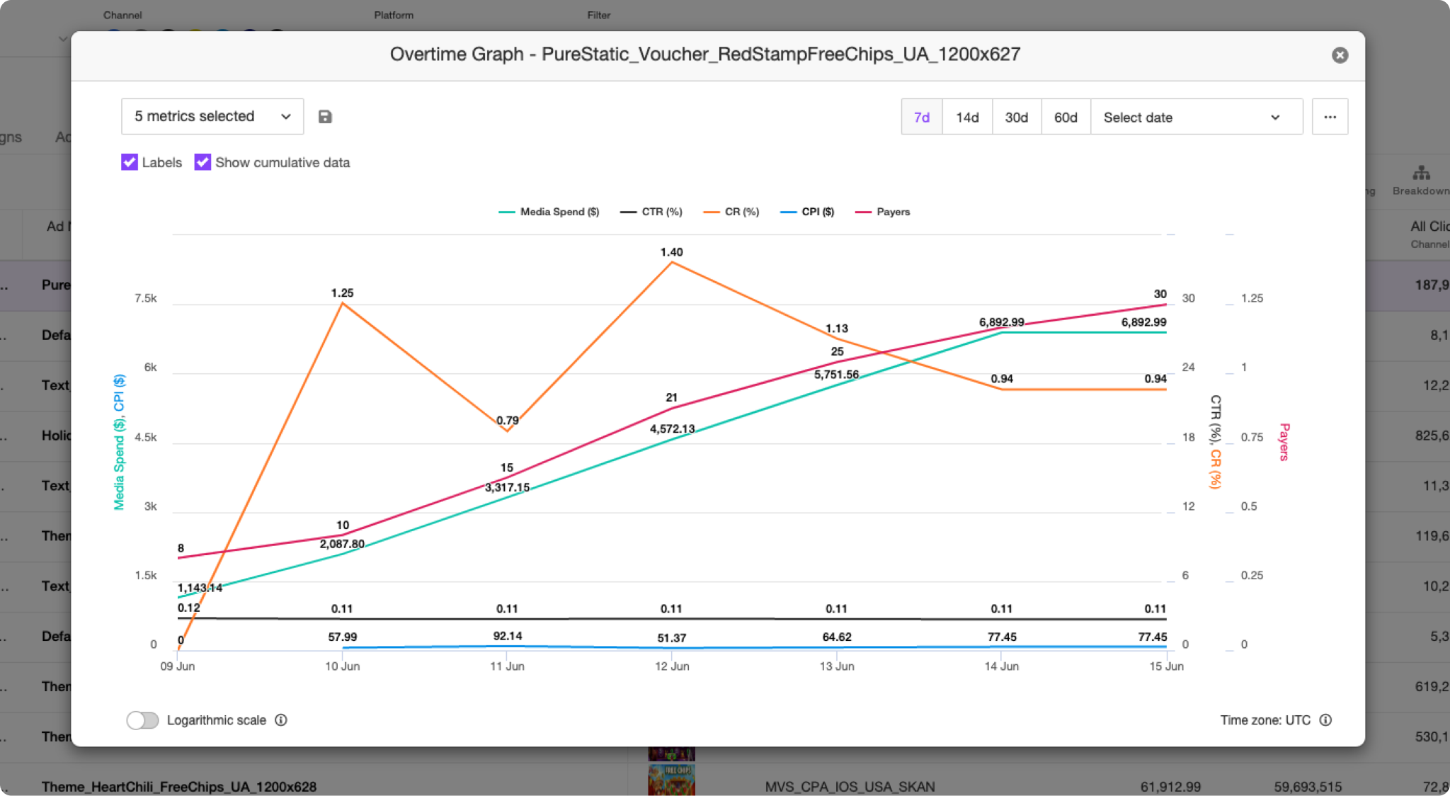
Over time Graph
The overtime graph used to be hidden behind entities and opened an outdated modal. It was one of the most used features in the system, and we wanted to spotlight it and add more capabilities that our users have been asking for.
The OTG could now show all activity data, giving a great overview when first entering the page.
we also added the ability to compare entities and add notes.
Before
After several usability tests, I decided to have the ability to show/hide and have S/L/full-screen views of the graph.
View/Compare
In the past users could view a single entity on the graph. we added the abitly to compare multiple entities. In comparison mode, I added an indication of color next to the selected row in the table to connect it visually to the line chart.
Add note
UA managers make many changes to their activity trying to improve performance
and reach targets. While analyzing past performance, It's hard to identify factors they know may affect the activity, changes like a “Sale” or a “New app launch”.
Having a note they can attach to an entity and a time frame solved this.
Results
When the UI was updated, we made sure to have an intercom tour guide showing all the changes. Like all new UI rollouts, some experienced users took time to get used to the new design. We were actively listening to their feedback and making changes to enhance the user experience based on their input. Overall the newly added features were widely adopted