From an ocean of data to
actionable insights
Analyzing large sets of complex data and transforming them into a clear visual format. Enhancing the efficiency of UA managers, enabling them to make informed decisions more quickly and effectively.
Team
3 Developers, 1 Product manager, 1 Director of product, Marketing team
My role
Lead product designer
Time line
6 month
Background
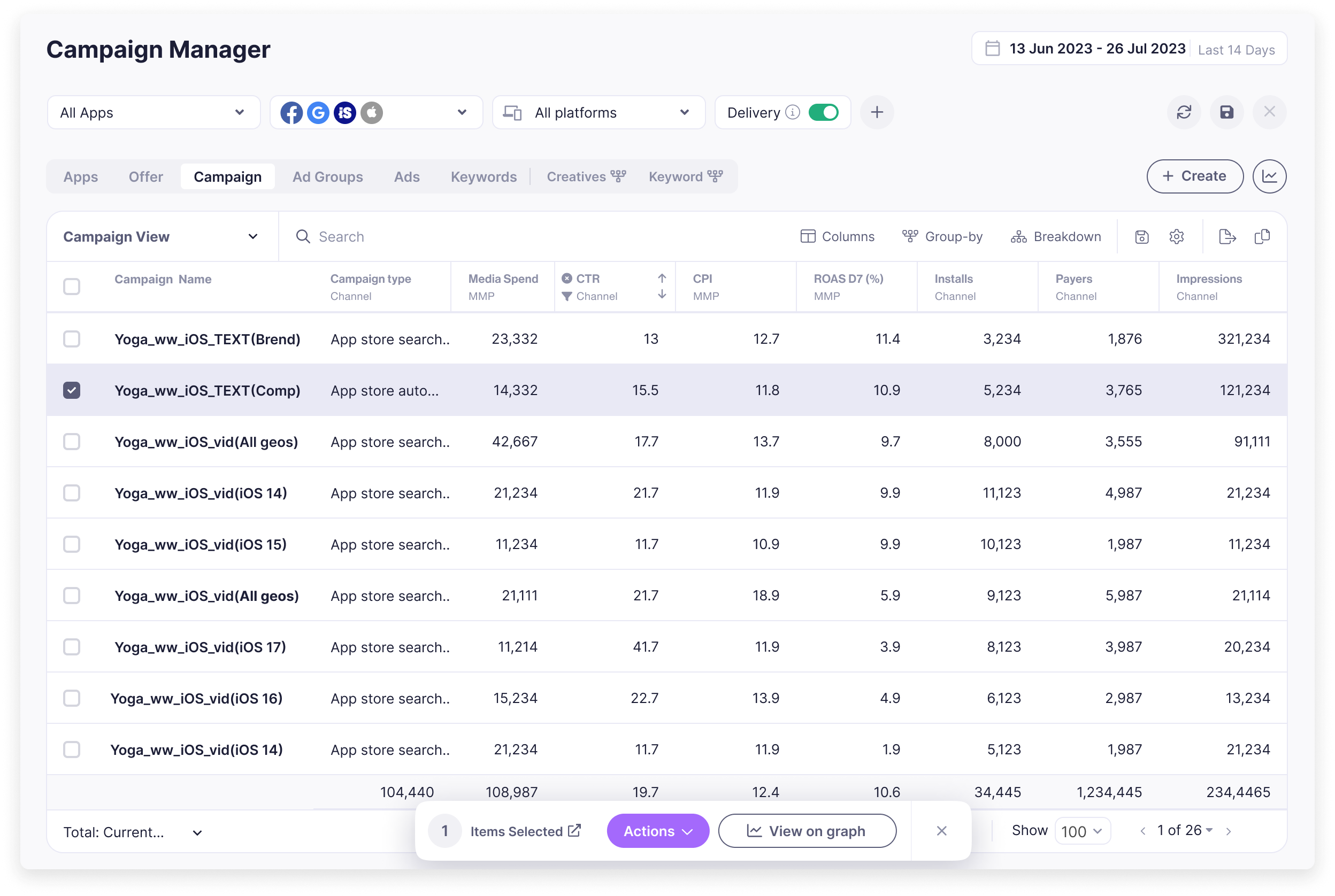
Luna is a Marketing Intelligence platform that drives growth by providing Visibility & Control over marketing campaigns on multiple channels. Up until this project, the main screen for viewing and analyzing your data was a campaign manager table of big data sets with many layers of functionality like filtering and grouping that the user needed to find each time he analyzed his activity.
Creating a report required exporting data to Excel and then building a visual report, in order to share with colleagues.
Users pain points
- Data overload and system complexity, asking the right questions and finding the answers in a complex system.
- Every client has different ways to measure their activity
- Team collaboration between stakeholders is a challenge when it comes to decision-making
Goal
To empower users with the freedom to explore their data, obtain insights, and collaborate with team members to share their findings.
The business bottom line was to have more Clients & users paying for the product tracked by monthly recurring revenue (MRR)
User Journey
The user journey consists of seven main repeated steps, some are owned by the media team, and some by the creative team.
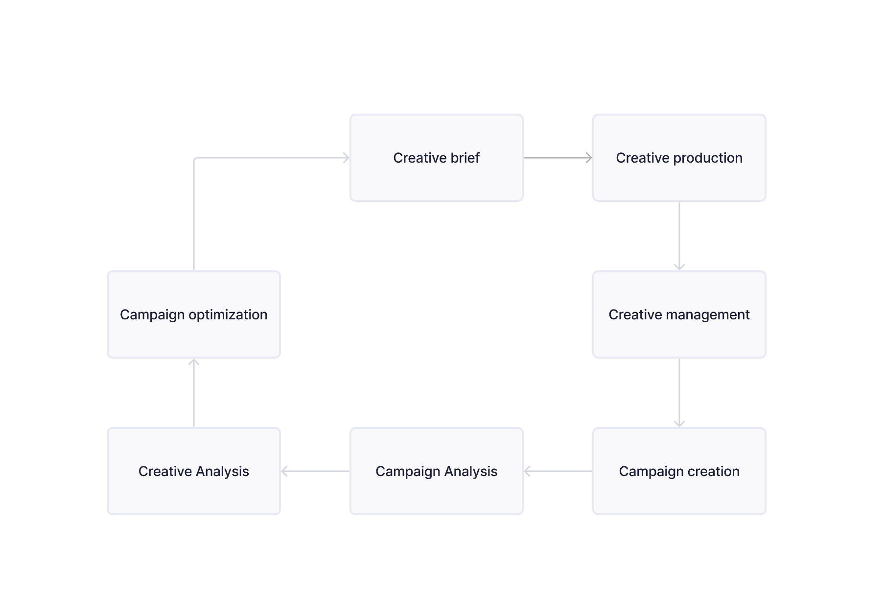
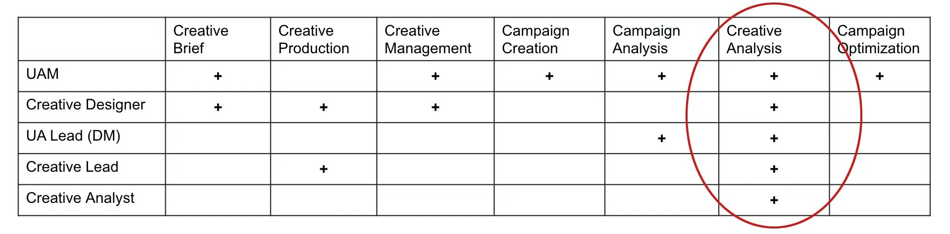
User roles
Different team members experience different user journeys. Blind spots will also differ from one user to another. We identified the area in the journey with the highest relevance score for different role-type users.
Research
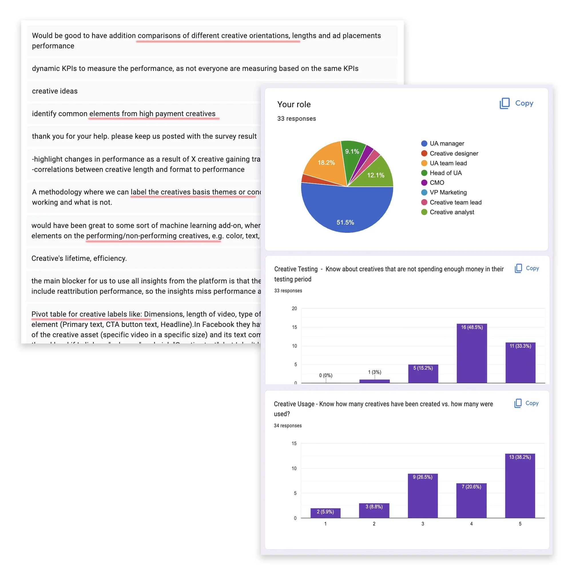
We used traditional research methods, such as:
Objective data, in-depth interviews, and User surveys to find users' needs and questions when analyzing their activity.
The primary takeaway was that while the data table did show all the needed readings, it was difficult to find any meaningful information and wasn't very useful if a user didn't know specifically what they were looking for.
Another takeaway was each client has unique goals and ways to track their activity success.
Team collaboration between stakeholders presented a significant challenge and an opportunity for us to bring in more user types to the product.
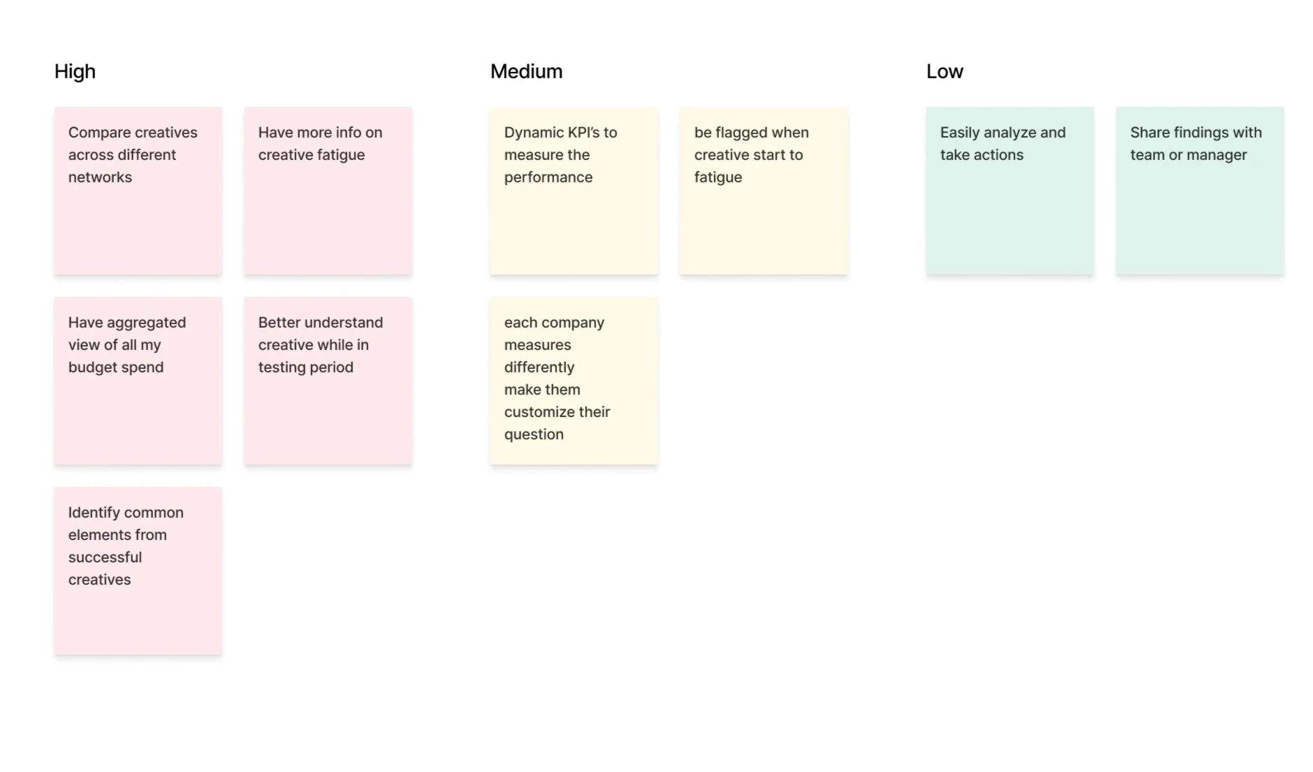
Use cases
Together with the team, we sorted and categorized the use cases focusing on our target audience's motivations.
Conclusion
We hypothesized that a visual representation of the data would be the best way to help organize the different questions users ask when analyzing and help flag changes in the activity. We decided to start with 8 pre-made widgets to answer the most pressing use cases.
I began researching different platforms that use custom dashboards (Looker, Google Analytics, Tableau, Sisense etc) and dip-dived into the world of data visualization.
Product plan
This project was an 6-month long project broken up into sizable chunks where me and the team defined the strategy with key stakeholders and collaborated with engineering on various technical challenges.
We set a few steps for releasing this epic.
the steps below were at times not linear and moved back and forth between different areas as most projects often do.
Navigation
Layout
Filtering
Unique widgets
Custom widgets
Actions
Sharing
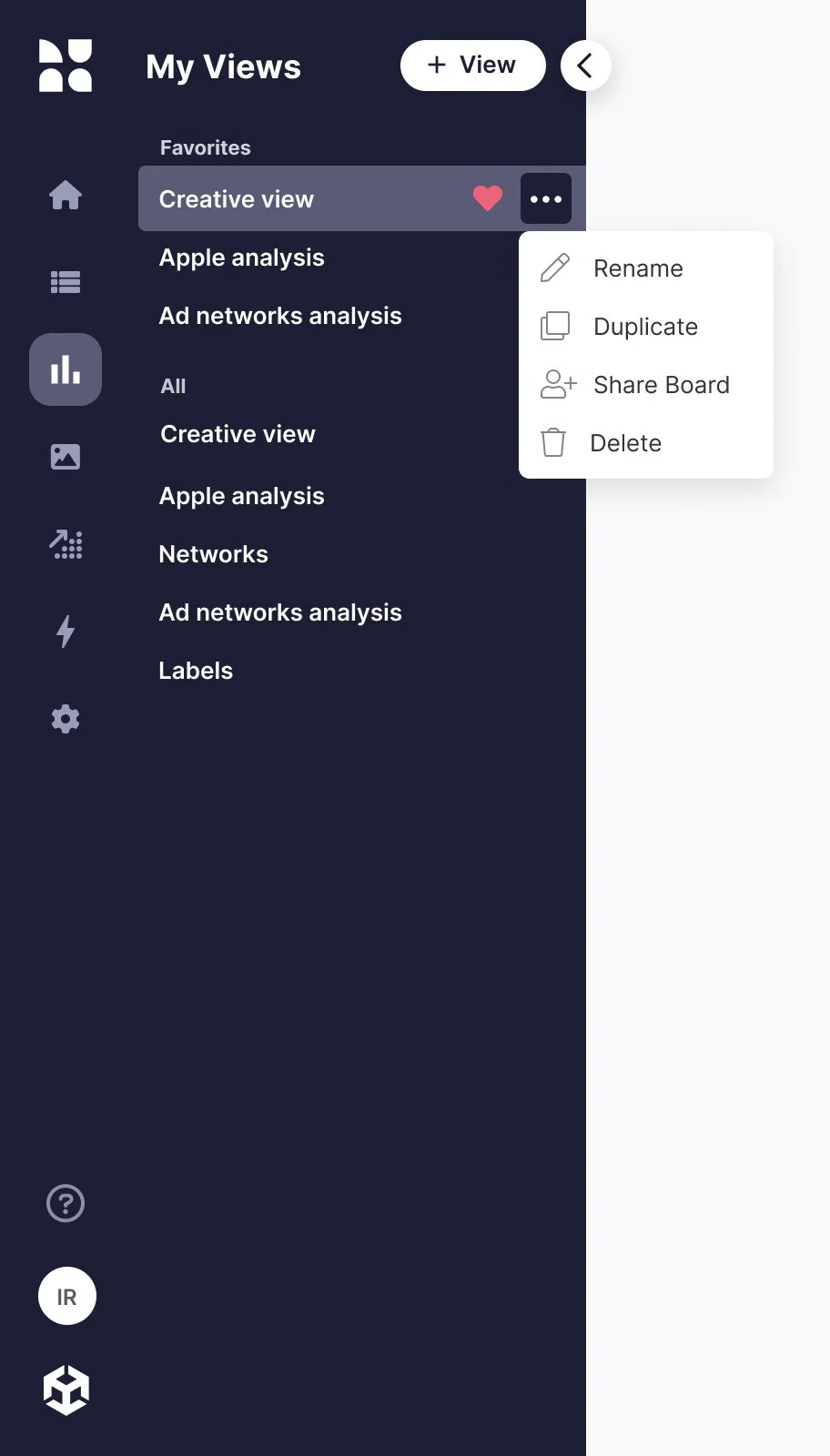
Navigation
When first entering the page a side panel is opened with a list of all the created views, divided into Favorites & All.
For the MVP we only built one template view with the premade widgets but after the custom widget was created the internal CSM team could build different templates tailord to their client's needs.
so on first use, the client already had views to start using and customize if needed.
Layout
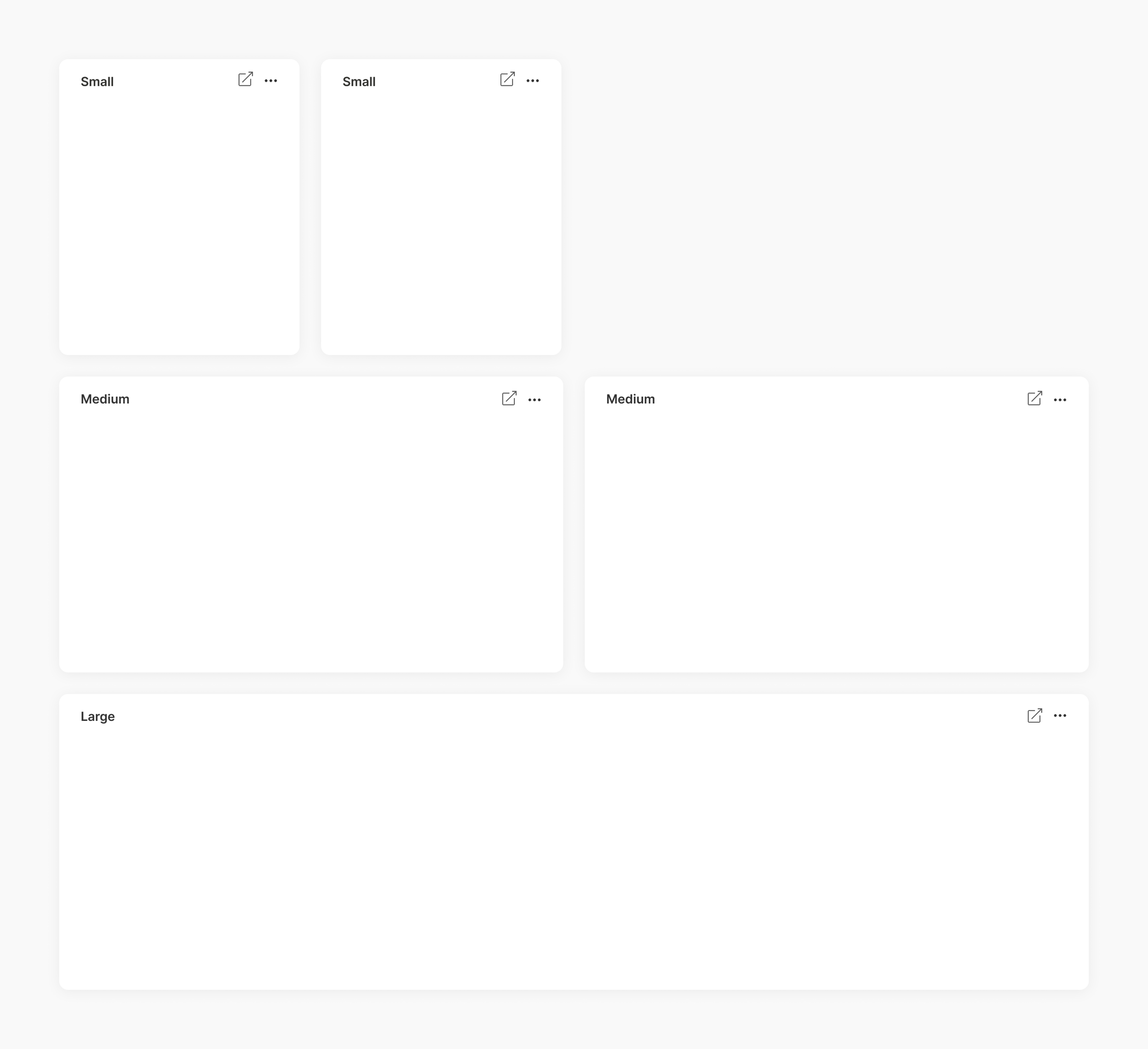
I looked at several BI tools and dashboard systems. Many let users fully adjust the width of each widget, but I felt this might be overwhelming. I was influenced by Apple's OS widgets that offer set sizes - S, M, L, XL - which provide users with the right level of control.
Filtering
I aimed to make the filters aligned with the filters we already used in the CM but more intuitive. Usability testing helped refine interactions, revealing the need to save filter sets, change them, and revert to saved sets while allowing users to hide them when many filters are applied.
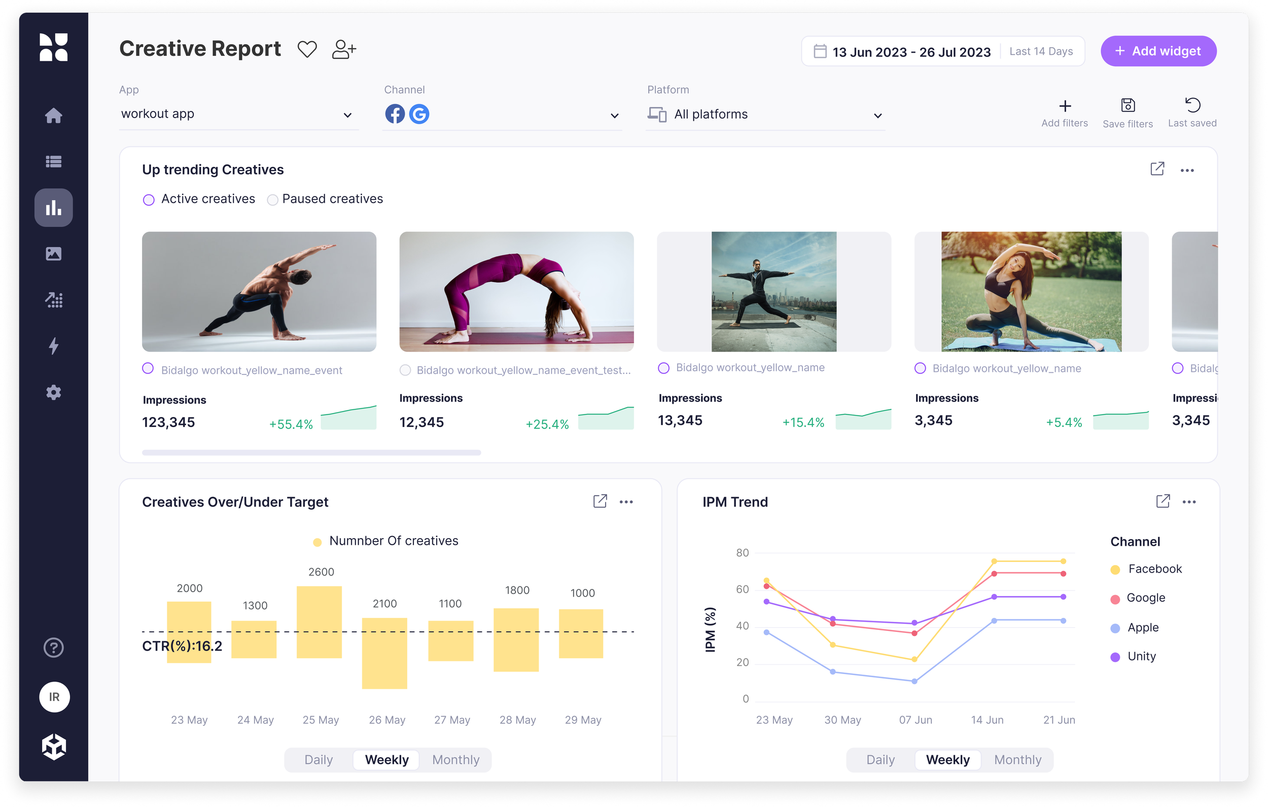
Widgets
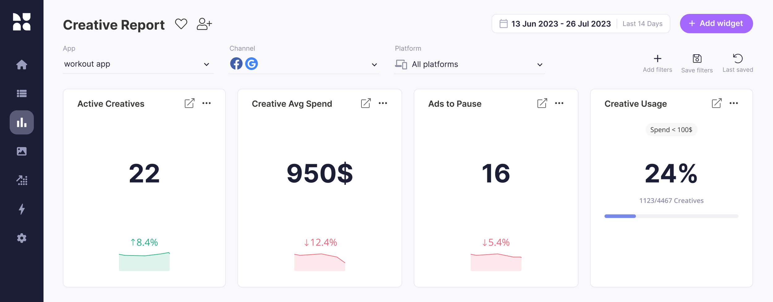
We initiated the project with 8 unique widgets based on our research data, each designed for a specific use case. Following additional feedback, we developed a customized widget, you can view them all in detail below
Every widget features an editable title on the left and a button to open detailed data in a new tab within the Campaign Manager where they can dig more and take action.
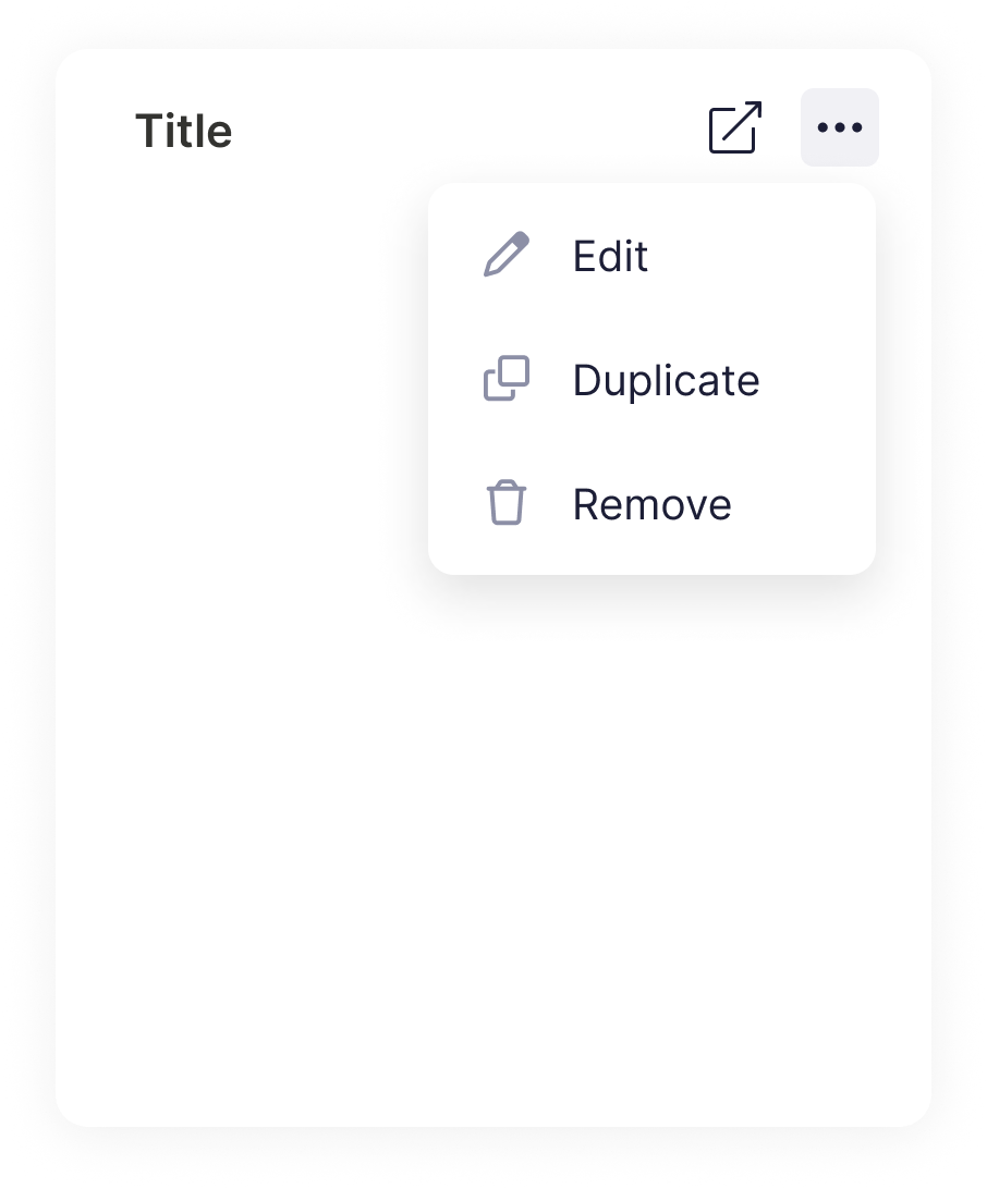
Under the three-dot menu, users have the flexibility to edit, duplicate, or delete the widget according to their requirements.
Adding a new widget
This is where users can choose to add various types of widgets. We wanted a robust section that would be able to accommodate future widgets. The library is sorted into categories and includes a search bar for quick access.
Creative overview widgets
The first widgets were made to show a quick overview of your creatives:
how many creatives are active, the average spending per creative, ads that could be paused, and creative usage.
Up/Down-trending creatives
Discover which creatives had the largest KPI increase compared to the previous timeframe.
Once the user notices the creatives that interest him, he can examine them in the campaign manager and take action,
like adding trending creatives to new campaigns or pausing creatives that don’t do well.
Creative testing
The three-axis graph visualizes the average performance of all creatives uploaded during the given time frame.
Axis Y, as well as the size of the bubble (Axis Z) are user-defined KPIs.
This chart lets you quickly identify creatives that worked best in their testing period and how they compare to others.
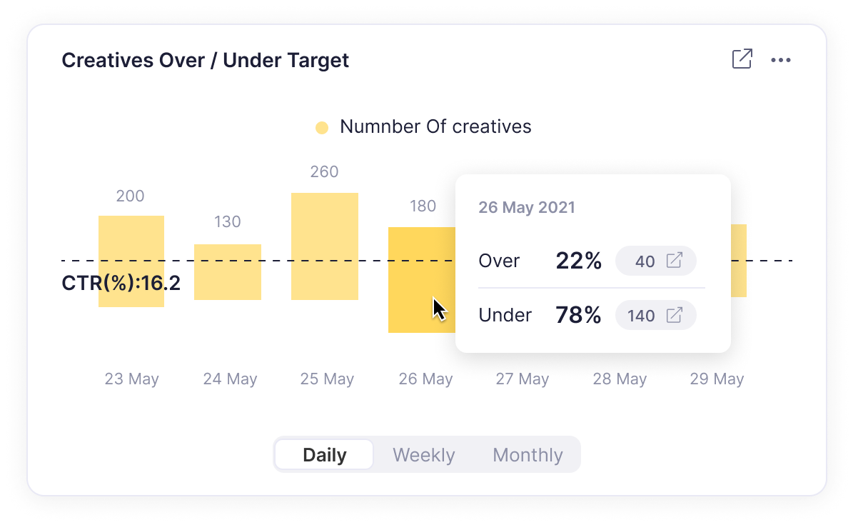
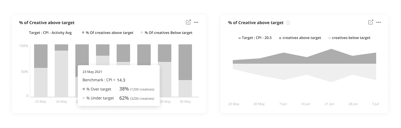
Over/under target
This widget lets users discover how many creatives have reached the user-defined benchmark over time in a glimpse making it a great high level overview.
Custom widget
After successfully developing the initial 8 widgets, we received positive feedback.
Further input indicated a demand for customization, as individual clients sought unique data interpretations. In response, we focused on creating a flexible widget that can show up to 3 metrics and 2 group combinations. Depending on the metric/group selection the users can then choose the chart type to best display their selection.
Sharing
One of the key elements we initially focused on was fostering team collaboration among stakeholders. As a result, a UA manager can now generate a customized view, invite their team lead and creative designer, or construct a report tailored for their marketing VP and export it to PDF. This streamlined process enhances communication and synergy within the team, Ultimately boosting productivity.
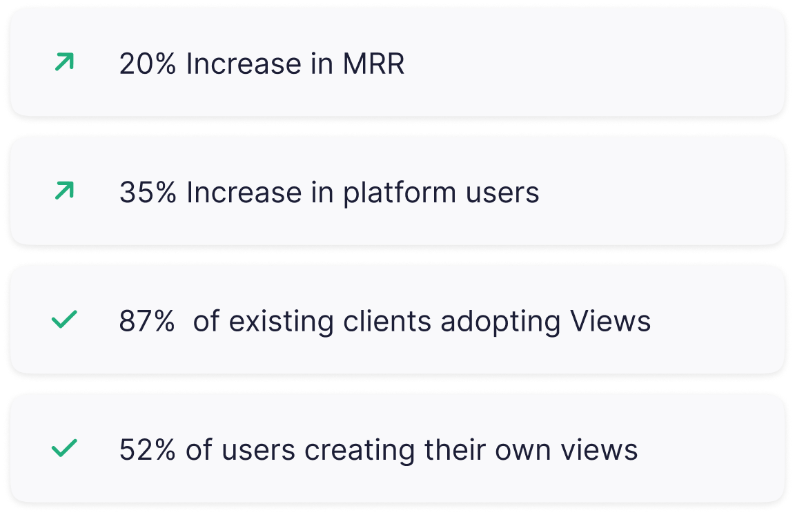
Results
Testing showed the new product reduced the time to analyze from as much as an hour to only minutes increasing user satisfaction and stickiness to the product.